Adsense,CorelDRAW,PHP,Tutorial,mysql,Inspiration,beginner,basic,Bali,Ebook,css,Actions,Brushes,Fonts,Photos,Logo Design,PSD,Photoshop,Pattern,Light,Coloring,Bling Text Effect,Textures,ajax,javascript
Sunday, July 12, 2009
Bling Bling Text Effect
Sunday, July 5, 2009
60+ Handwriting Fonts Cool Collection
Saturday, July 4, 2009
Painting the figures with Photoshop cs4
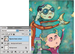
opacity of the brush to 100% and the
flow to 50%. Add this brush to the Tool Preset picker and name it “ base color, ” as we’ll be using it to create a flat, colored base for the figures and the stars. Use this brush to add flat color on the new layer in all empty regions of the figures and the stars. Choose colors from the background via the Eyedropper or select them from the Swatches palette. Increase or decrease the size of the brush tip as necessary.
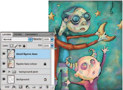
18 Create a new layer and select the Chalk Blender preset that you created earlier from the Tool Preset picker. As you did earlier with the background, blend the colors beneath this layer together with the Chalk Blender preset on your new layer. Hold down Alt(PC)/Option(Mac) to quickly sample colors from the canvas and then paint with your newly sampled colors in the appropriate areas until sharp areas of color begin to blend together on this layer. Feel free to alter brush size and opacity as required. Also, feel free to add new areas of color on this layer to indicate highlights and shadows.
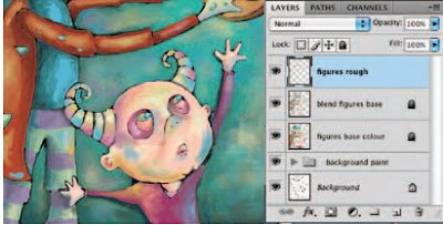
19 When you are finished adding colors and creating a blending effect on this layer, create a new layer and target it in the Layers palette. Select your Spatter Brush preset from the Tool Preset picker. Now use the spatter brush to paint some light, yet rougher brush strokes over your recently blended areas on the new layer. Use colors sampled from the canvas or from the ever-growing amount of custom swatches in the Swatches palette. Vary the brush size and opacity as needed. You probably want to leave the flow setting fairly low so that the bristles remain pronounced in each stroke.
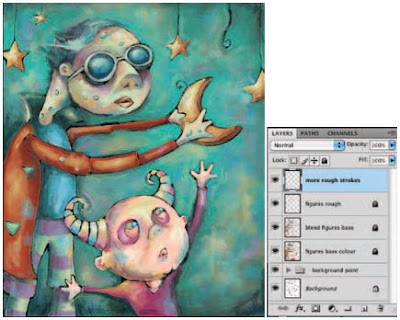
20 Now use your three custom brushes as well as your dual brush to really add a sense of roughness to the figures and the stars by painting with them on the current layer. Vary size, color, and opacity as needed. Also, if you feel like experimenting, yet are worried about making a mistake on your current layer, go ahead and create another layer to work on. This way, if you like the effect, you can keep the layer. If you don’t like it, you can always delete the layer or even reduce the opacity to lessen the effect.
Friday, July 3, 2009
Viewing Photoshop’s Parts and Processes
Reviewing basic computer operations
Chapter 3 looks at Photoshop-specific aspects of working with floating panels, menus and submenus, and tools from the Options bar, but I want to take just a little time to review some fundamental computer concepts.
Launching Photoshop
You can launch Photoshop (start the program) by double-clicking an image file or through the Applications folder (Mac) or the Start menu (Windows). Mac users can drag the Photoshop program icon (the actual program itself) to the Dock to make it available for one-click startup. You can find the file named Adobe Photoshop CS4 inside the Adobe Photoshop CS4 folder, inside the main Applications folder. (Chapter 3 shows you the Photoshop interface and how to get around in the program.)
Never open an image into Photoshop from removable media (CD, DVD, your digital camera or its Flash card, Zip disks, jump drives, and the like) or from a network drive. Always copy the file to a local hard drive, open from that drive, save back to the drive, and then copy the file to its next destination. You can open from internal hard drives or external hard drives, but to avoid the risk of losing your work (or the entire image file) because of a problem reading from or writing to removable media, always copy to a local hard drive.
Make The background and figure outlines
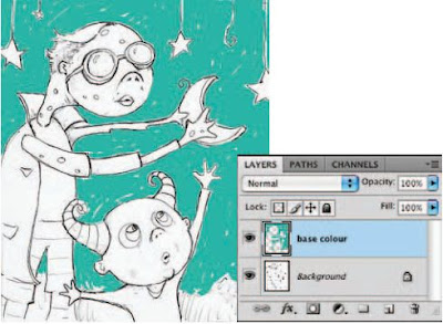 5 Target your new layer in the Layers palette and begin to paint a series of strokes on the new layer. Focus on areas that are the background, as indicated in the sketch. Just start painting some strokes; don’t cover the line work of the sketch on the underlying layer; and allow a little white to show through between strokes here and there. Also, increase and decrease the brush diameter in the Brushes palette to accommodate different regions on the canvas. For open areas of the background, use a brush of very large diameter; for tighter regions, such as between the small figure’s fingers, use a brush of much smaller diameter.
 6 Choose a different color from either the picker or one of your own custom swatches and paint the background area at the bottom of the canvas. When you’refinished, choose a black foreground color and create a new layer in the Layers palette. Target the new layer and use the brush to begin tracing the black outlines of the underlying sketch on this new layer. Reduce the opacity of your brush in the Tool Options bar to 50% so that there is a translucent effect as you paint small strokes over the top of each other.
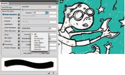 7 Click on the Brush Tip Shape option from the left in the Brushes palette. Use this area often to vary the angle of the brush as you paint. You’ll need to tweak the angle frequently when painting around areas such as the heads of these creatures. If you don’t adjust the angle at times, there will be areas where the strokes appear too thin compared to others. Click on Shape Dynamics in the Brushes palette to enable Shape Dynamics and then on the Angle Jitter Control menu to view the options.
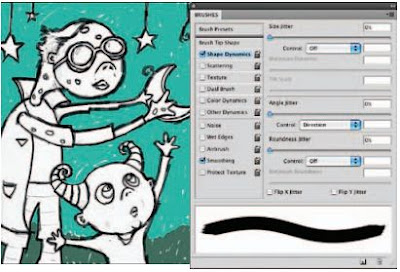 8 Choose the Direction option from the Control menu, but leave the angle jitter amount set to 0. This setting causes your brush to base the angle of the brush tip on the directions of your stroke as you paint them. Because we still want a somewhat smooth edge to the strokes, the amount is set to 0. The more you increase the amount, the rougher the edges of the strokes will appear. By simply enabling the Shape Dynamic function, you can save yourself the trouble of having to constantly adjust the angle as you paint. Finish painting the black outline.
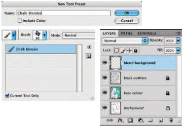 9 Reduce the opacity of your brush to 25% and then open the Tool Preset picker at the far left of the Tool Options bar. Click on the Create New Tool Preset button. When you are prompted, name the tool “ Chalk Blender. ” Disable the Include Color option and click OK. This brush is now added to the preset picker, with all of the Brushes palette options and dynamic functions intact. You can access it directly from the preset picker from now on. Create a new layer in the Layers palette and ensure that it is targeted.
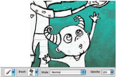 10 Use your current brush, set to 25% opacity, to blend the background fill colors together on the new layer; this is precisely why we named the preset “ Chalk Blender. ” Start by painting strokes over the areas where light and dark colors meet. Paint dark strokes over light areas, and vice versa. Go back and forth painting like this until colors begin to blend together. Change the direction of your brush strokes often as well as the size of your brush tip. Also, if using an opacity of 25% does not give you a blend effect that is as smooth as you’d like, try reducing it when necessary.
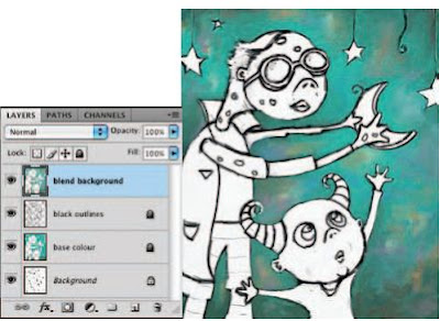 11 Now add different colors from the Swatches palette into the background here and there, using the same brush on the current layer. Try initially adding them using a higher brush opacity setting, and then blending them into the background using lower opacity settings. A quick way to work is to Alt(PC)/Option(Mac)-click on areas of the canvas to sample color rather than always returning to the Swatches palette. This technique is especially useful when blending as you can sample “ in-between ” colors. Using this method, if you happen to sample a foreground color that you like, feel free to add it to the Swatches palette so that you can access it later.
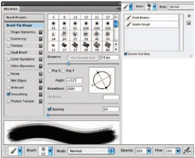 12 In the Brush presets section of the Brushes palette, select the spatter 59 pixels Brush Tip preset. Now, in the Brush Tip Shape section of the Brushes palette, adjust the angle of the brush tip until you’ve achieved the roughest looking stroke possible. In the Tool Options bar, set the opacity of the brush to 35% and the flow value to 15%. Save this new brush as a tool preset and name it Spatter Rough.
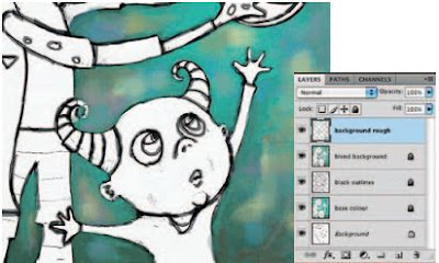 13 Create a new layer and use your newly created tool preset to paint over areas of the canvas on this layer. Increase or decrease the opacity as required and use colors from the canvas or the Swatches palette. The goal here is to paint with the new brush over areas that look very smooth. Because of the brush tip and very low flow setting, the resulting strokes will add a rougher, more textured feeling to the areas you paint. Using large brush strokes and bold colors will pronounce the rough effect. Use this effect sparingly as it can tend to overpower an illustration.
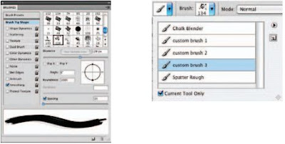 14 Open up the brush1.jpg file. Choose Edit > Define Brush preset from the menu. Name your brush and return to the working file. Choose your new custom brush tip from the end of the list in the Brush Presets section of the Brushes palette. In the Brush Tip Shape section of the Brushes palette, set the spacing to 1. In the Tool Options bar, set the opacity to 50% and the flow to 15%. Save this brush as a new tool preset. Use this same method to open up brush2. jpg and brush3.jpg and save them as new tool presets, using the same spacing, opacity, and flow settings.
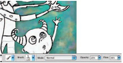 15 Now that you have added three new custom brushes and a new dual brush to the Tool Preset picker, use them to paint some rough strokes on this layer. Just because the presets contain embedded settings for opacity and flow, that doesn’t mean that you can’t change them each time you use them. Use a variety of colors, brush sizes, opacity, and flow settings to introduce some very real and tactile feeling brush strokes on the current layer. Again, ensure that you do not overdo it as these new brushes, which produce such distinct strokes, can visually overpower the softly blended background quite easily.
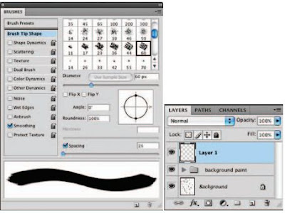 16 When you’re finished, target the top layer and then Shift-click on the layer directly above the background layer in the Layers palette. This will target all of your paint layers. Choose Layer > N e w > Group From Layers from the menu to add them to a group. Because we’re going to start painting the other image components, this grouping of layers will help us keep things separate and organized. Create a new layer for the base color of the figures. In the Brushes palette, choose one of the default chalk brush tip presets. Ensure that Smoothing is enabled, and in the Brush Tip Shape section of the palette, reduce the spacing amount to 1.
Thursday, July 2, 2009
Photoshop CS3 : Auto Blend Keren
Kali ini saya akan kasih tutorial tentang bagaimana cara nya menggabungkan banyak foto dengan tanpa keliatan list pinggirnya atau bahasa design nya nge-Blend atau nge-blur pinggirnya.cara manual sebenernya bisa. Tapi untuk yang sudah pake adobe Photoshop CS3, bikin bgituan gampang banget. Toolnya udah disediain yaitu Auto Blend Layer.
Seperti biasa buka file baru ukuran brapa aja… kalo buat wallpaper di desktop kamu buat file baru dengan ukuran 1024 x 768 px. Saya kasih contoh pake ukuran kecil aja yaa.

Udah gitu… cari file-file gambar yang mau digabungin.. 7 atau 8 gambar aja. Buka semuanya di photoshop.

Terus Tarik gambar-gambar tadi ke file yang baru dibuat. (Drag & Drop) terus atur sedemikian rupa…


Kalo dah selesai ngaturnya… skarang le Layer Palette. blok semua layer gambar kecuali layer background. terus Klik Edit > AutoBlend-Layer.

Hasil akhirnya begono nih.. hehehe..

Keren kan bos… tapi sayang nya cuman ada di adobe photoshop CS3
Cara Mengubah Ukuran Gambar
Specialized software (Photoshop CS4)
However, there are a number of things for which Photoshop isn’t designed that you can do in a pinch. If you don’t have InDesign, you can still lay out the pages of a newsletter, magazine, or even a book, one page at a time. (With Bridge’s Ouput panel, you can even generate a multipage PDF document from your individual pages.) If you don’t have Dreamweaver or GoLive, you can use Photoshop to create a Web site, one page at a time, sliced and optimized and even with animated GIFs. You also have tools that you can use to simulate 3D in Photoshop CS4, such as Vanishing Point
Page layout in Photoshop isn’t particularly difficult for a one-page piece or even a trifold brochure. Photoshop has a very capable type engine, considering the program is designed to push pixels rather than play with paragraphs.
Photoshop even shows you a sample of each typeface in the Font menu. Choose from five sizes of preview in Photoshop’s Preferences➪Type menu. However, you can’t link Photoshop’s type containers, so a substantial addition or subtraction at the top of the first column requires manually recomposing all of the following columns. After all, among the biggest advantages of a dedicated page layout program are the continuity (using a master page or layout) and flow from page to page. If you work with layout regularly, use InDesign.
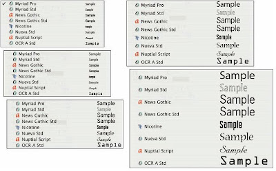 Font previews in five delicious flavors!
Photoshop CS4 and Photoshop CS4 Extended
So, if you have Photoshop CS4 rather than Photoshop CS4 Extended, should you feel cheated or like a second-class citizen? Nope! Unless you specifically need those extended features, there’s no real reason to purchase them. But what if you got Photoshop CS4 Extended as part of a Creative Suite or Adobe Bundle package of software — did you pay forsomething you don’t need? Well, sort-of-yeahbut-not-really. The folks who’re really paying extra for the extended features are those who purchase Photoshop CS4 Extended as a standalone program. The additional cost they pay funds the research and development of the extended features.
So why didn’t I get to choose between Photoshop CS4 and Photoshop CS4 Extended when I ordered my Bundle or Suite? Buying software shouldn’t be as complicated as, say, ordering a cup of coffee. (Caf, de-caf, half-caf? Latte, espresso, cappuccino? White, brown, or raw sugar? Cream, half-and-half, milk, or skim? Small, medium, large, super, or el grosso maxmo?) It could get quite confusing. Imagine trying to wade through all of the thousands of products if Adobe marketed every possible combination as a separate Bundle or Suite or Studio! You’d spend so much time trying to find your perfect bundle, you’d never get to use the software.
Other things you can do with Photoshop
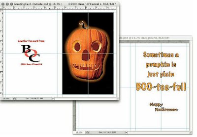 only Photoshop. One of the features that sets Photoshop apart from basic image editors is its powerful type engine, which can add, edit, format, and stylize text as capably as many word-processing programs. Photoshop even has a spell check feature — not bad for a program that’s designed to work with photos, eh?
Even if you don’t have the high-end video features found in Photoshop CS4 Extended, you can certainly supplement your video-editing program with Photoshop CS4 (even if Photoshop can’t open and play movies you capture with your video camera). From Adobe Premiere (or other professional video programs), you can export a series of frames in the FilmStrip format, which you can open and edit in Photoshop.
Paint With Photoshop CS4
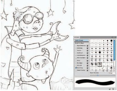 1.Open up the sketch.jpg file. Starting with a sketch is an essential part of the process when painting in the tactile realm, and working in Photoshop is no exception. The main difference here is that in this case the sketch is scanned rather than being drawn directly onto the canvas. Once you’ve opened up the sketch, select the Brush tool. In the Brushes palette, enable the Smoothing option at the left. We’re going to work with this option enabled for the entire chapter because smoothing guarantees that your brush strokes contain nice, smooth curves. And that is an essential quality when you want your painting to look convincing.
Although Photoshop is equipped with a plethora of excellent brush libraries, we’re going to focus on some simple default brushes capable of producing exceptional results.
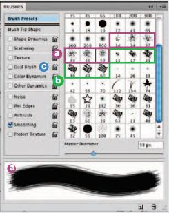 a. The spatter brushes may not look like much within a vast list of presets,but these simple clusters of spots are very useful. There are a number of different tips and sizes to choose from. Regardless of which option you go with, any spatter brush gives the effect of using a brush with some stray dry bristles sticking out around the edges. Painting over the top of the colored regions of the canvas with a spatter brush allows you to create a bristled, tactile effect.
 b. The chalk brushes are denser than the spatter brushes but equally as useful. Strokes created with chalk brushes do not have any stray bristles sticking out the sides, but they do provide a nice rough effect at the beginning and at the ending of each stroke. They are ideal for establishing basic, yet convincing, colored regions within your painting.
c. The Dual Brush option is an excellent tool that allows you to combine two different brushes within a single tip. Why do we point out this single feature amid a sea of others? Well, using the Dual Brush option allows you to quickly and easily combine two brush tips to create a new one. We’ll explore this feature in detail using custom brush tips later in the chapter.
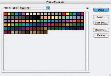
2 Now, the next thing we’re going to do is establish the Swatches palette as our paint palette and fill it with our own set of colors unique to this painting. By doing this, we can return to the Swatches palette and select one of our custom colors at any point later on. Choose Edit Preset Manager from the menu. Choose Swatches from the Preset Type menu. The Preset Manager can also be accessed via the Swatches Palette menu. If you access it via the Swatches Palette menu, the Preset Type is automatically set to Swatches. When the swatches appear, click on the first swatch and then Shift-click on the last swatch. This will target all of the swatches. When all of the swatches are targeted, click on the Delete button. After they’re all deleted, click on the Done button to exit the Preset Manager, and you’ll notice that the Swatches palette has been emptied.
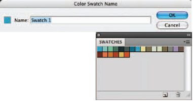 3 When the Swatches palette is empty, click on the Foreground Color swatch in the toolbox to access the picker. Select a new foreground color from the picker and click OK. Move the mouse over the empty area of the Swatches palette. You’ll see it temporarily switch to a paint bucket. When you see the paint bucket, click to add the new color to the Swatches palette. Name your new swatch when prompted and then click OK. After naming, the new color is added to the Swatches palette. Use this method to add a variety of colors to the Swatches palette. This method is an excellent way to exercise a little forethought, establishing a predefined color scheme to work within before you begin painting.
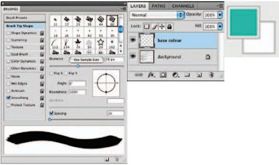
4 After selecting the Brush tool, choose the largest Chalk Brush preset from the Brushes
palette. In the Brush Tip Shape section of the Brushes palette, increase the diameter of the brush. You want a large brush here because, first, we want to cover most of the background with color, giving us a new base color other than white. Leave the spacing option enabled but reduce the amount to 1 so that there is no stepping or spaced brush marks present within your strokes. Choose a foreground color from the Swatches palette and click the Create a New Layer button in the Layers palette.
Wednesday, July 1, 2009
Creative Techniques and Working Methods Photoshop Cs4
When you decide to use Photoshop as your digital paint tool, you’ll never run out of paint or canvas, you’ll never misplace your favorite tool, and you’ll never have to worry about cleaning your brushes at the end of the day. As you work your way through this chapter, not only will you learn to paint methodically, but you’ll also gain an understanding of the organizational potential within Photoshop.
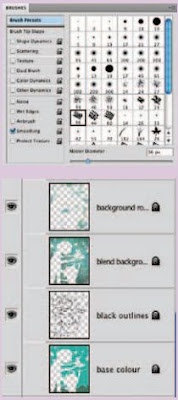
The Brushes palette
The Brushes palette is an excellent resource for crafting convincing and customized brush looks. Whether you want to simply tweak a preset brush tip or create something entirely new with which to paint, everything you need is there.
Painting on layers
Layers are invaluable tools when painting too, as they allow you to separate applications of paint, giving you the flexibility to edit specific painted regions and colors without affecting the rest of your image. In addition to editing advantages, layers also allow you to easily and gently build up brush strokes within your file, resulting in a beautiful and authentic appearance.
Painting in Photoshop
Equally as valuable when it comes to painting are all of the image compositing tools at your disposal. A successful painted result relies not only on actual brush strokes but also on the way the image is carefully constructed within Photoshop. In this chapter, rather than predictably going through every single appropriate tool and feature like a list, you will focus more on establishing a logical method of working as well as explore the techniques involved in building up a realistic-looking painted file.
What Photoshop is designed to do
 Basic Photoshop: Take photo, edit photo, print photo. Drink coffee (optional)
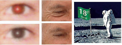 Some common Photoshop tasks.
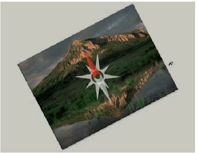
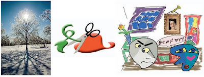 You can use Photoshop with raster images, vector artwork, and even to paint.
Exploring Adobe Photoshop
Welcome to Photoshop!
Whether you’re new to Photoshop, upgrading from Photoshop CS3 or earlier, or transitioning from Elements to the full version of Photoshop CS4 or Photoshop CS4 Extended, you’re in for some treats. Photoshop CS4 has an intriguing new look that enables you to do more, and do it more easily, than ever. Before I take you on this journey through the intricacies of Photoshop, I want to introduce you to Photoshop in a more general way. In this chapter, I tell you what Photoshop is designed to do, what it can do (although not as capably as job-specific software), and what you can get it to do if you try really, really hard. I also review some basic computer operation concepts and point out a couple of places where Photoshop is a little different than most other programs. At the end of the chapter, I have a few tips for you on installing Photoshop to ensure that it runs properly.
Deliberate Mismatching
You can deliberately mismatch your ad colors and styles, provided you keep it to the top of your page.
This distinction generates two powerful 'zones' and therefore two types of experience for the visitor.
The first zone is always at the top of the first page, above the main site banner. The titles and text colors match colors found in the banner graphic heading. (Important — the URL links are hidden, so only certain text ads wiallow you to do this.)
The end result is that these ads, placed above the banner graphic look like key control points for your site and are just more likely to be clicked. The visitor feels that they are visiting another major area of that site.
Where Did My URL Go?
But you still have to display the URL. It’s one of Google’s rules. But you don’t have to display it in a way that people can see it.
One legitimate trick to make the click-through link less obtrusive is to change the URL display color to match the text description color. Now the link will blend in with the text description and the eye will be drawn to the hyperlink instead of the URL. Google provides these tools for you. Why not use them?
Note that the 728 x 90 leaderboard and the 468 x 60 banner do not display the URL line by Google’s design. It is not a mistake and you will not get in trouble for the URL not appearing with these ad blocks. It’s just the way it is.


